For me it’s the lack of a zoom feature. If you order the data fields correctly, zooming in and out of a single screen can replace several different data pages. It seems such a simple feature and I don’t think I have seen it anywhere else.
I’m a Garmin user and have been for a long time. Their user experience isn’t the most intuitive. You have to “learn it” and after that, it’s not bad. Wahoo’s claim to fame is the ability to setup/manage the entire GPS unit from your phone. Garmin is constantly improving, but it’s not on par with Wahoo yet.
So, I think the gripes about Wahoo vs Garmin are less true than they used to be, but when it comes strictly to the UX, there is still a gap. I generally find Garmin hardware on devices to be superior.
I’ll put a vote in for the LEDs on Wahoo computers. They animate to show navigation directions (left or right), and you can set them up to indicate power or heart rate zones (both the number of LEDS and the color change to match the zone you’re in).
I use them in both training and races - I can see in my peripheral vision what zone I’m in, so I can monitor my efforts and pace appropriately.
I realize some of you can do this purely based on feel and experience, but the LEDS aren’t affected by adrenaline - so they’re really handy for pacing during the start of a race …
If they die within 12 months Wahoo replace without fuss - presumably Garmin would do the same. So I don’t look on a sub-12 month death as a problem. Now a 13 month death…
This is based purely on my personal experience as a consumer, as well as a small circle of friends.
My comments are specifically about the smaller electronic devices. I find the smart trainers to be built like tanks. That’s why it was frustrating that the other supporting devices weren’t as rugged:
Issues with multiple Tickrs that was ultimately a strap design flaw. There’s a long TR thread on Tickr issues.
Cadence sensor that had a cheap attachment solution and a pry-apart battery case that got progressively more damaged with each battery change. The battery contacts weren’t beefy and required putting padding behind the battery to get it to properly engage.
A friend has gone through GPS multiple head units (I forget which model) with the screen delaminating and the device randomly resetting, making it unreliable for rides.
I wanted to like the Wahoo ecosystem, based on my positive trainer experience. But, I got too frustrated and I’ve moved away. I now own multiple Garmin devices. I like the battery covers that are clearly designed to be removed and replaced and seem secure. Attachment straps and contact points that look like they have anticipated being used in poor conditions.
Not the sexiest but they give me confidence that they are well constructed. Again, just my opinion and experiences.
I would still buy a Wahoo trainer but pass on the smaller electronics.
Garmin user experience during rides/workouts? Garmin surpasses Wahoo during rides and outside workouts.
Over 99% of my interaction time with Garmin is glancing down at the screen during a ride/workout. That and a bunch of useful machine learning HRV / HR / power based data.
Newer generation (1040, I forget what watches) has at least improved the experience whereby you can configure screens from the mobile app. It’s not as nice as Wahoo, but it is an improvement.
I gave Wahoo a chance - because I like what they do and want them to succeed however in the end I jumped fully into the Garmin ecosystem and don’t regret it. There’s flaws but in the end you have to admit it is a nice cohesive experience with everything working together.
I have tried for my life to use Garmin, and even went at bought the Garmin 1040. Holy hell the screen is reflective and the colours and navigational cues are bad…
I spent so much time trying to see where I even was on the map with the arrow the size of a rice grain and in a baby blue color. All mashed in between all other colors.
I understand most other things with Garmin, but UX and their navigation (design), oh man, so bad!
Say whatever you wish about the graphics, but I can at least see where I am going without looking down for 5+ seconds.
Like, how can the arrow showing the next turn be larger than the arrow showing where I am? And also why is the route thinner than the “non” route road? So many questions…
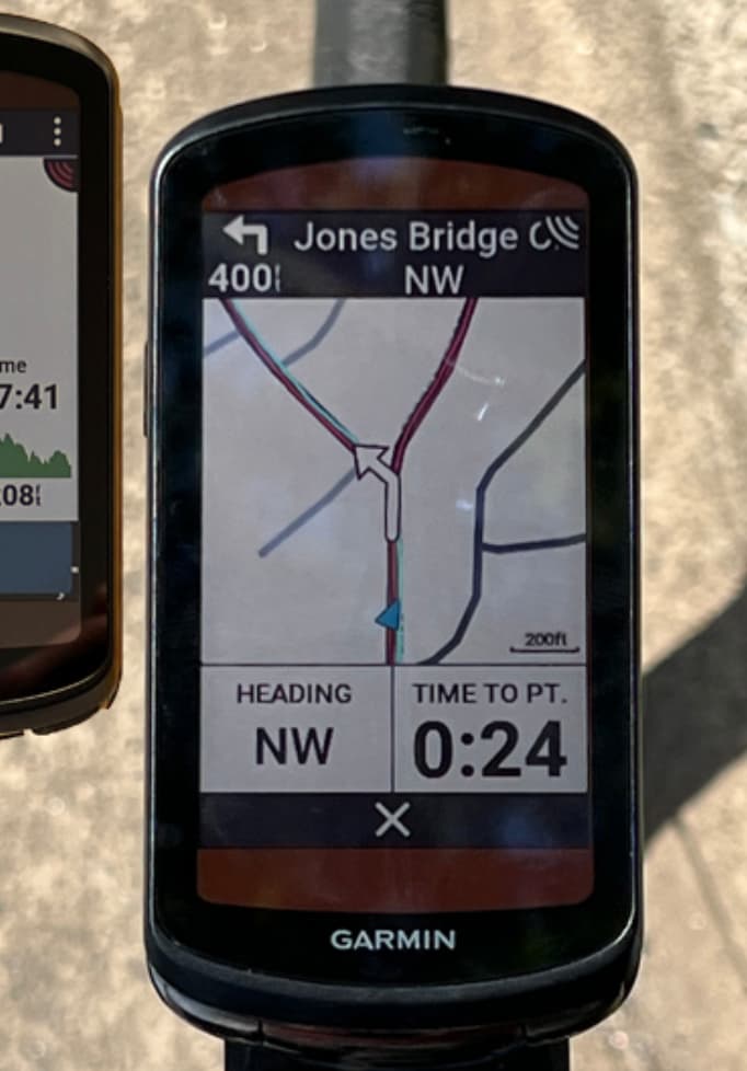
Turn left in 400 feet on Jones Bridge, its huge, and at a glance I can see there is a fork in the road and I’m going left in about 20 seconds.
I’m not studying the map, just quickly glancing down to see what’s coming and about how long. And the name of the street, because road signs. Why can’t Wahoo tell you the name of the road? I just rode a rented bike in Palm Springs area for the first time. Garmin 530 gave me a heads up with the name of the street, and I could clearly see the street signs before and at intersections for confirmation. So easy.
I don’t have any issues on the smaller 530 screen, and my eyes are sixty plus years old
Might be different with road names in the US versus Europe then maybe?
Because in Sweden and Spain where I ride a lot, you cannot see the street names because they are always on the buildings on a sign that’s 50+ years old and worn, and if there are no buildings there are no street names. We don’t put street names if there are no buildings to place them on (at least in Spain and Sweden).
So for me at least, I am navigating by the map 100% of the time, needing to quickly scan where on the map I am to be able to match that to the environment.
Wahoo on the other hand lets you know when to turn in distance. So it beeps and says “in 200m…”
My issues with the 530 size are not really when I’m navigating but more that I like a single screen with all my data that I care about and that’s where a larger screen would be nice. I kinda wish garmin would have a screen size between a 530 and a 1040. Like a 3” display. But I’m strongly considering upgrading to the 1040
On 530 I get street names and it lets me know when a turn is coming.
Last week I get a beep and navigations shows something like “Turn right on Bike Trail” and I can see a roundabout and left turn. And I’m thinking “Bike Trail?”
I despised the 530. I noped so fast away from it which took me to Wahoo before going to the 1040. The 1040 both in size, interface, touchscreen, and mapping is what sent me back to Garmin.
Yeah, but it is much harder to see what you should do after that. When having to navigate within cities or close to them, you often have to make several turns in quick succession. Or to conclude that you have to cross three intersections and make a turn at the fourth. The chevrons clearly identify the route at a glance.
Honestly, I had no idea that the routes were displayed as badly on Garmins as they are shown in @Dubadai’s photos.
Honestly I didn’t remember that routes were displayed as poorly on Wahoo as they are shown in that pic
Seriously six of one, half dozen the other. Except for the street names. And street names when navigation is turned OFF. Sub-maximal updates of my FTP. And estimates of how I’m responding relative to recent baseline (machine learning of hrv, hr, and power).
That’s one of the things I really liked about switching from an Edge to the Wahoo Bolt. The Bolt was a lot easier for me to see and read things at a quick glance in all conditions
That and, probably unlike a lot of people, I personally prefer physical buttons vs a touch screen when it comes to a bike computer
It’s useful until your reading vision gets worse as you age. I can’t read more than about 4 fields per page. So, I put a premium on large, bright, screens.