It would be nice if there were better analytic graphs, it seems a pretty easy win and would make good use of all the power/hr data imported in.
This comes from Strive.ai and they have a range of times you can look at showing your w/kg and how it’s changing over time. They have a rolling few months but it could look like our power curves where you could show it over a year/month/whatever range you go for.
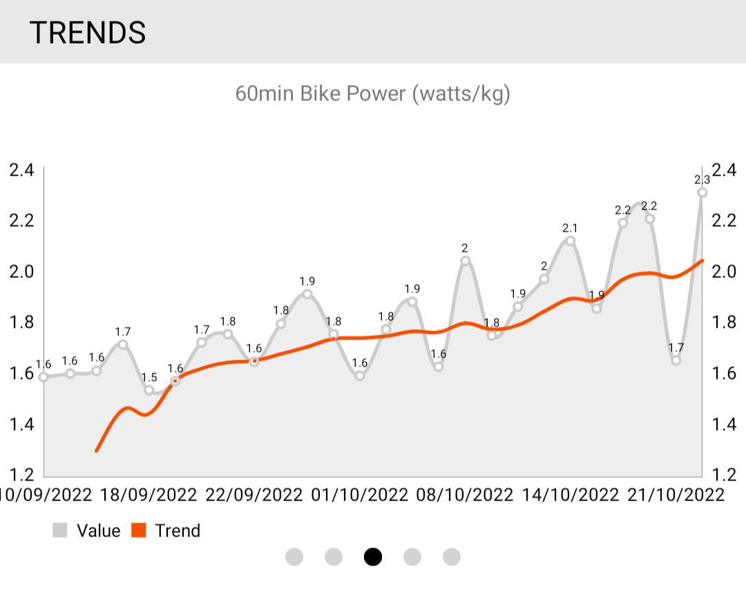
This image is just a basic matplot graph showing my gradual w/kg improvement and took me plenty long enough since it was learning but for a non-learner, I bet it would be a quick win.
2 Likes
I like that. There are a lot of easy wins on TR analytics, and I’d imagine TR has a large backlog by now.
Thanks for this! We do have some plans for improved PR chart visibility, but I like watts/kg here, and I also appreciate the visibility of the incremental values on your example without having to hover over. Good stuff!
For your specific request of watts/kg, that would involve some somewhat regular/frequent input of weight, dependent upon the timelines being displayed, which may be tricky.
I’ll pass this along to the team for consideration. Thanks again!
2 Likes
Yeah I understand that it would require more regular updates, was initially done to learn how to do it so thought it could be an idea!
1 Like
Natively integrating with e.g. Withings scales would help here. I subscribe to smartscalesync primarily to get my weight into my Garmin account, but it also supports TR.
I’ll add this to Ivy’s feature request!
1 Like
It’s almost like Apple Health integration might take care of this for us iOS users with smart scales 
1 Like