Is it possible to re-arrange what is shown in each field of the app?
I guess this will be very specific to the individual needs, but I would love the ability to have the interval metrics (avg int power, HP etc) as well as the interval power/HR/cadence graph at the same time (currently they ‘live’ in the same field as each other with a swipe needed to move between them.
For me, the all up workout graph is less relevant, with the breakdown of the intervals in text form even less so. Having the ability to define what data lives in what field so that you can display exactly what you want, when you want would be a really useful option (for me at least!)
Other than that, the app is spot on and really happy with the progress I’m making!
Hey @TonySA1989!
Welcome to the forum! I’m excited that you are making progress!
Thanks for the suggestion for more customisable metrics across the mobile and desktop apps. This is something I have heard before from other athletes so I will be sure to pass this on to the team.
In the meantime, have you tried using the desktop app? I think the desktop app matches your preferred layout more closely. As you’ll see in the screenshot below, you can click on the “Stats” arrow in the right-hand corner of your screen to see the interval metrics as well as the usual “live” metrics.
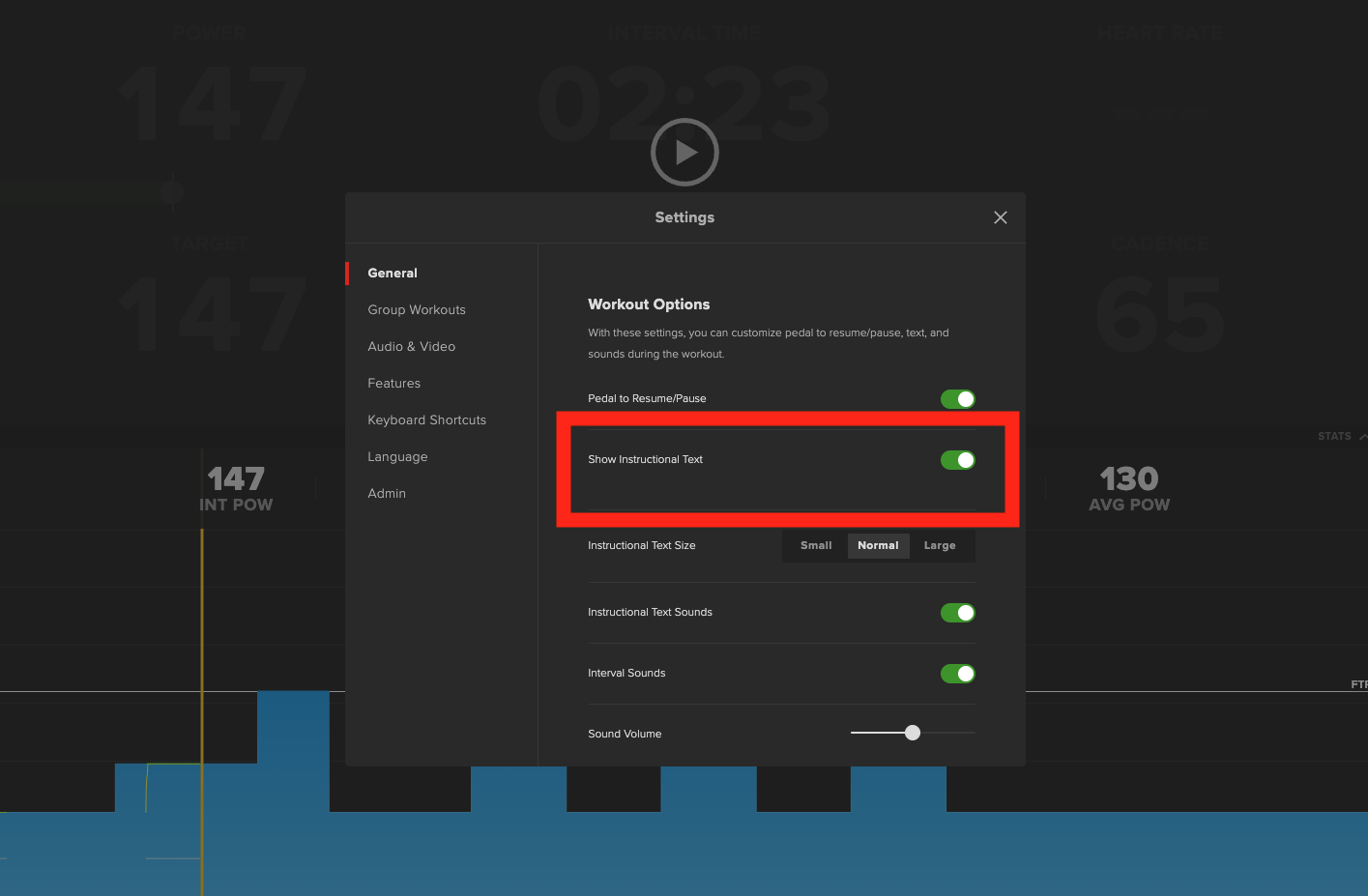
Likewise, if you’d prefer not to view Workout text mid-workout, you can turn this off in Settings.
You can access Settings mid-workout by going to the three dot menu in the top right corner of your screen.
- Then hit Settings
- You will see the following options
- Toggle “Show Instructional Text”.
In comparison to the mobile apps, the larger screen while using the desktop app, makes viewing the workout graph easier. You can see the details of each interval without having to zoom in.
Thanks again for the suggestion. We really appreciate your feedback!